Ever since the first beta, the development team has been paying close attention to discussions among Proxies. We greatly appreciate everyone's interest in New Eridu, and would love to share the creative stories behind it.
For the first installment of our creative notes, we've brought in Zhenyu Li, Zenless Zone Zero's producer, to share his story with us. Let's see what he has to say~
"Breakthroughs come from the details and thinking constantly about how to bring innovation to the combat experience."
When it comes to combat, the development team continuously explores new ideas that focus on gameplay details, aiming to provide Proxies with a unique thrill.
In this issue, we'd like to share our thoughts on innovative approaches to character Chain Attacks, Perfect Assists, and switching characters:
Q: What are your thoughts on innovative combat mechanics?
A: There are so many outstanding action games out there. Given this, building a groundbreaking combat system is certainly no easy task. With Zenless Zone Zero, we've been consistently striving to innovate in various aspects and exploring new creative inspirations to provide players with a distinct and enjoyable combat system.
Q: What approaches were explored during the early stages of development?
A: I've always thought the "dodge + bullet time" mechanic in past action games is an incredibly good design. It cleverly adjusts the camera's movement speed, creating a slow-motion effect to provide players with immediate visual excitement.
The Chain Attack mechanic between our characters is designed with the same principle of instant satisfaction through slow motion. If "dodge + bullet time" is considered a defensive action, we've transformed it into an offensive action to complement Zenless Zone Zero's fast-paced combat.
Q: What are your thoughts on the experience after implementing Chain Attacks during the Tuning Test?
A: For the Tuning Test, Chain Attacks were the only mechanism where we incorporated strong positive feedback during combat. But as I played the game, I realized that limiting strong feedback to offensive actions is somewhat dull, and I had this feeling that it was "always my turn to attack and never defend."
So for the Equalizing and Amplifying Tests, we not only increased enemy aggression and their endurance, but also introduced parries for playable characters in the form of the Perfect Assist system. The system is primarily designed to provide positive feedback in addition to the Chain Attack system, allowing players to experience instant satisfaction when both attacking and defending.
When considering action animations for a multi-character combat game like Zenless Zone Zero, we chose to have teammates join the fray and assist defensively, providing varied visuals and experiences.
Q: Speaking of fighting as a squad, what new designs have we implemented?
A: For instance, when it comes to switching characters, we want to enhance the sense of immersion. Envisioning a teammate join the battle from beside you gives the feeling you're not alone in combat.
We place great importance on team combat. In addition to switching out characters, why do teammates enter the scene to execute Chain Attacks after the mechanism is triggered? Why are Defensive Assists also carried out by teammates? The essence of these actions lies in multi-character combat, which further highlights the concept of teamwork.
"Expressing visually what one is skilled at and passionate about, and striving for excellence."
Speaking of Zenless Zone Zero's unique feel, another aspect often brought up is its rich visual style.
Moving on, let's talk about your thoughts on the overall visual style, graphic design, and UI design.
Q: Where did the choice to go with an urban theme come from?
A: It actually came from personal experience. I specialize in packaging and graphic design, and an urban theme provides ample opportunities for team members to unleash their creativity. Everyone is doing what they love and are skilled at, which is why we came together to create Zenless Zone Zero.
Building on this foundation, our goal is to enhance the sense of immersion, to bring players closer and establish a connection between the content we want to convey and daily life.
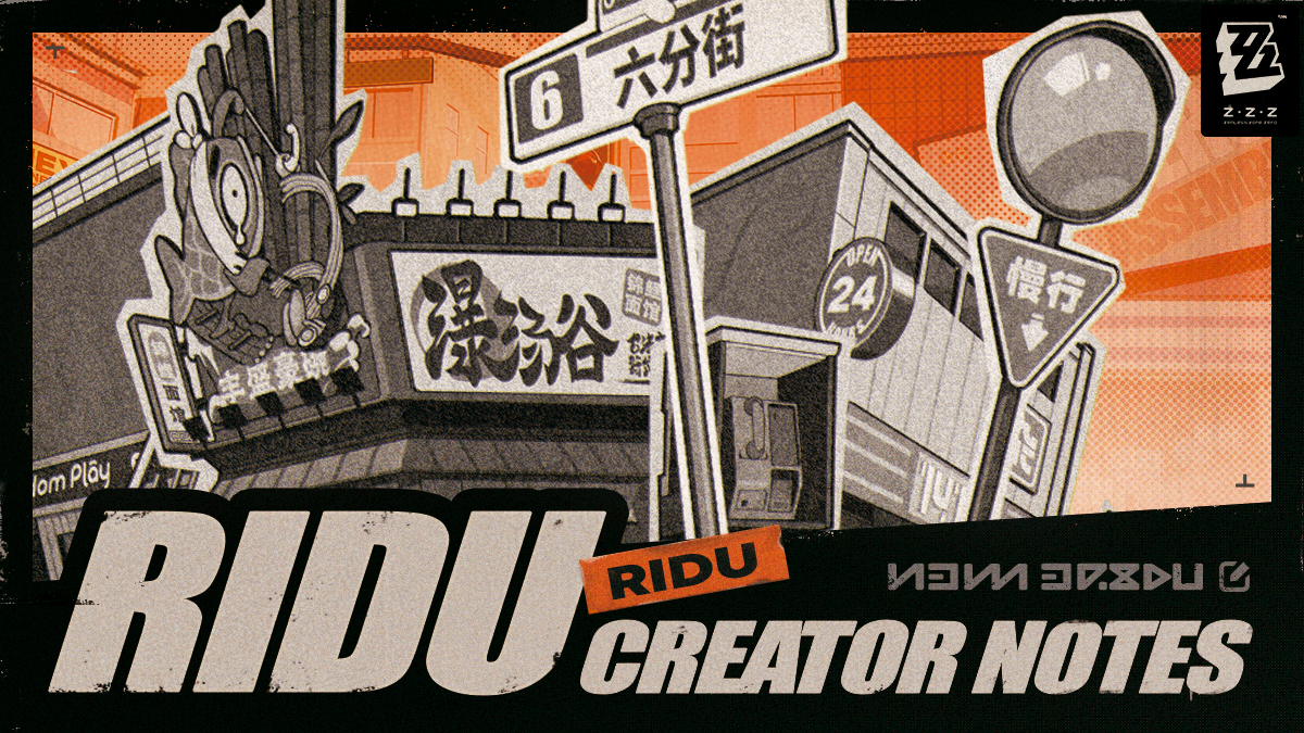
Q: We can see a lot of graphic design elements within the game (such as the graffiti on Sixth Street). What makes this aspect so important?
A: I think a good urban theme relies heavily on numerous signs and advertisements, so good graphic design is something we wanted to prioritize. When creating urban-themed content, one challenge is the absence of natural landscapes to enhance the atmosphere, so we focused on architectural and brand graphic design, using common everyday elements to provide immersion.
With that said, aside from ensuring top-quality scenes, attention to detail in UI design was also essential.
For example, in the early stages of development, we were contemplating how to blend new concepts and produce visually stunning characters. At the time, our team consisted of about ten members, and with limited personnel, we needed to decide carefully where to allocate animation and artistic resources.
So we came up with the idea of using high-quality visual packaging with minimal animated transitions and experimented with them in the frequently used character development interface to highlight the different characters' traits.
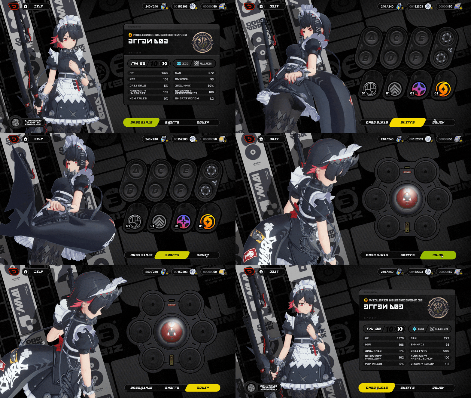
(*Effects are in development and may change before release.)
Q: This feature attracted a lot of attention during the Tuning Test. What were your main considerations during the design process?
A: There were many discussions at the time about the presentation of details. Showing complete character movements would make them more dynamic, but I was also contemplating how to complement them with suitable camera angles to define the characters.
With such a comprehensive page, we also need to consider both graphic elements and composition. Due to the dense layout of information on the right, the composition of the character display on the left needs to be as relaxed as possible to achieve a more balanced overall visual effect.
While this may be a small feature, we hope it offers a distinct experience. Going forward, we'll continue to adhere to this mindset and leverage the team's creativity to further improve the game's content.
That's everything we have to share for this edition. Moving forward, we'll intermittently interview other members of the development team, offering readers more behind-the-scenes Zenless Zone Zero stories.
The Amplifying Test is currently ongoing. Feel free to give us your feedback and suggestions during the test. Let's build a better New Eridu together~ Whether you're spending time on Sixth Street or exploring the Hollows, we hope Proxies enjoy their time in New Eridu! Have fun, everyone!

